
The Problem
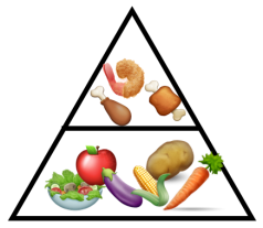
Imagine that you are a nutritionist trying to explore the nutritional content of food. What is the best way to differentiate food items? By vitamin content? Protein levels? Or perhaps a combination of both?
Knowing the variables that best differentiate your items has several uses:
1. Visualization. Using the right variables to plot items will give more insights.
2. Uncovering Clusters. With good visualizations, hidden categories or clusters could be identified. Among food items for instance, we may identify broad categories like meat and vegetables, as well as sub-categories such as types of vegetables.
The question is, how do we derive the variables that best differentiate items?
Definition
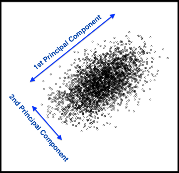
Principal Components Analysis (PCA) is a technique that finds underlying variables (known as principal components) that best differentiate your data points. Principal components are dimensions along which your data points are most spread out:
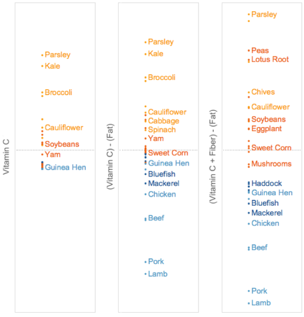
A principal component can be expressed by one or more existing variables. For example, we may use a single variable – vitamin C – to differentiate food items. Because vitamin C is present in vegetables but absent in meat, the resulting plot (below, left) will differentiate vegetables from meat, but meat items will clumped be together.
To spread the meat items out, we can use fat content in addition to vitamin C levels, since fat is present in meat but absent in vegetables. However, fat and vitamin C levels are measured in different units. To combine the two variables, we first have to normalize them, meaning to shift them onto a uniform standard scale, which would allow us to calculate a new variable – vitamin C minus fat. Combining the two variables helps to spread out both vegetable and meat items.
The spread can be further improved by adding fiber, of which vegetable items have varying levels. This new variable – (vitamin C + fiber) minus fat – achieves the best data spread yet.
While in this demonstration we tried to derive principal components by trial-and-error, PCA does this by systematic computation.
An Illustration
Using data from the United States Department of Agriculture, we analyzed the nutritional content of a random sample of food items. Four nutrition variables were analyzed: Vitamin C, Fiber, Fat and Protein. For fair comparison, food items were raw and measured by 100g.
Among food items, the presence of certain nutrients appear correlated. This is illustrated in the barplot below with 4 example items:

Specifically, fat and protein levels seem to move in the same direction with each other, and in the opposite direction from fiber and vitamin C levels. To confirm our hypothesis, we can check for correlations (tutorial: correlation analysis) between the nutrition variables. As expected, there are large positive correlations between fat and protein levels (r = 0.56), as well as between fiber and vitamin C levels (r = 0.57).
Therefore, instead of analyzing all 4 nutrition variables, we can combine highly-correlated variables, leaving just 2 dimensions to consider. This is the same strategy used in PCA – it examines correlations between variables to reduce the number of dimensions in the dataset. This is why PCA is called a dimension reduction technique.
Applying PCA to this food dataset results in the following principal components:

The numbers represent weights used in combining variables to derive principal components. For example, to get the top principal component (PC1) value for a particular food item, we add up the amount of Fiber and Vitamin C it contains, with slightly more emphasis on Fiber, and then from that we subtract the amount of Fat and Protein it contains, with Protein negated to a larger extent.
We observe that the top principal component (PC1) summarizes our findings so far – it has paired fat with protein, and fiber with vitamin C. It also takes into account the inverse relationship between the pairs. Hence, PC1 likely serves to differentiate meat from vegetables. The second principal component (PC2) is a combination of two unrelated nutrition variables – fat and vitamin C. It serves to further differentiate sub-categories within meat (using fat) and vegetables (using vitamin C).
Using the top 2 principal components to plot food items results in the best data spread thus far:
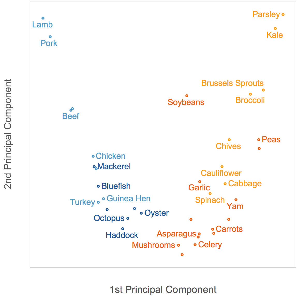
Meat items (blue) have low PC1 values, and are thus concentrated on the left of the plot, on the opposite side from vegetable items (orange). Among meats, seafood items (dark blue) have lower fat content, so they have lower PC2 values and are at the bottom of the plot. Several non-leafy vegetarian items (dark orange), having lower vitamin C content, also have lower PC2 values and appear at the bottom.
Choosing the Number of Components. As principal components are derived from existing variables, the information available to differentiate data points is constrained by the number of variables you start with. Hence, the above PCA on food items only generated 4 principal components, corresponding to the original number of variables in the dataset.
Principal components are also ordered by their effectiveness in differentiating data points, with the first principal component doing so to the largest degree. To keep results simple and generalizable, only the first few principal components are selected for visualization and further analysis. The number of principal components to consider is determined by something called a scree plot:

A scree plot shows the decreasing effectiveness of subsequent principal components in differentiating data points. A rule of thumb is to use the number of principal components corresponding to the location of a kink. In the plot above, the kink is located at the second component. This means that even though having three or more principal components would better differentiate data points, this extra information may not justify the resulting complexity of the solution. As we can see from the scree plot, the top 2 principal components already account for about 70% of data spread. Using fewer principal components to explain the current data sample better ensures that the same components can be generalized to another data sample.
Limitations
Maximizing Spread. The main assumption of PCA is that dimensions that reveal the largest spread among data points are the most useful. However, this may not be true. A popular counter example is the task of counting pancakes arranged in a stack, with pancake mass representing data points:

To count the number of pancakes, one pancake is differentiated from the next along the vertical axis (i.e. height of the stack). However, if the stack is short, PCA would erroneously identify a horizontal axis (i.e. diameter of the pancakes) as a useful principal component for our task, as it would be the dimension along which there is largest spread.
Interpreting Components. If we are able to interpret the principal components of the pancake stack, with intelligible labels such as “height of stack” or “diameter of pancakes”, we might be able to select the correct principal components for analysis. However, this is often not the case. Interpretations of generated components have to be inferred, and sometimes we may struggle to explain the combination of variables in a principal component.
Nonetheless, having prior domain knowledge could help. In our example with food items, prior knowledge of major food categories help us to comprehend why nutrition variables are combined the way they are to form principal components.
Orthogonal Components. One major drawback of PCA is that the principal components it generates must not overlap in space, otherwise known as orthogonal components. This means that the components are always positioned at 90 degrees to each other. However, this assumption is restrictive as informative dimensions may not necessarily be orthogonal to each other:


To resolve this, we can use an alternative technique called Independent Component Analysis (ICA).
ICA allows its components to overlap in space, thus they do not need to be orthogonal. Instead, ICA forbids its components to overlap in the information they contain, aiming to reduce mutual information shared between components. Hence, ICA’s components are independent, with each component revealing unique information on the data set.
Information has thus far been represented by the degree of data spread, with dimensions along which data is more spread out being more informative. This is may not always be true, as seen from the pancake example. However, ICA is able to overcome this by taking into account other sources of information apart from data spread.
Therefore, ICA may be a backup technique to use if we suspect that components need to be derived based on information beyond data spread, or that components may not be orthogonal.
Conclusion
PCA is a classic technique to derive underlying variables, reducing the number of dimensions we need to consider in a dataset. In our example above, we were able to visualize the food dataset in a 2-dimensional graph, even though it originally had 4 variables. However, PCA makes several assumptions, such as relying on data spread and orthogonality to derive components. On the other hand, ICA is not subjected to these assumptions. Therefore, when in doubt, one could consider running a ICA to verify and complement results from a PCA.
Did you learn something useful today? We would be glad to inform you when we have new tutorials, so that your learning continues!
Sign up below to get bite-sized tutorials delivered to your inbox:

Thanks to Aram Dovlatyan for pointing out a typo in this post.
Copyright © 2015-Present Algobeans.com. All rights reserved. Be a cool bean.

Thank you for this good explanation (and for the wonderful book you wrote on the topic of data science).
Concerning PCA: I also just wrote a blog post which tries to give some intuition and I would be interested in your feedback:
http://blog.ephorie.de/intuition-for-principal-component-analysis-pca
LikeLike
Appreciate your posting this wonderful article.
I’m a long time reader but I’ve never been compelled
to leave a comment. I activated to your website and distributed this in the facebook or myspace.
Thanks again for a great post!
LikeLike
Thanks Cheap SMM Panel, we’re delighted to hear from you and glad to know you enjoy reading our posts 🙂
LikeLike
Hi annalyn,
wanted to ask how do u get the grouping from the variable correlation matrix. I am able to obtain the correlation. But suppose in a scenario where i have 20 variables. How do i know which variables are grouped? i.e fat + protein vs fibre + vit c for dimension 1.
LikeLike
Correct me if i am wrong, i found that we can plot variable factor map to identify the grouping 😀
LikeLike
Hey guys,
any chance to get the dataset you were using for this tutorial?
Thanks! 🙂
LikeLike
Hi Alex, you can download the data at this link: https://ndb.nal.usda.gov/ndb/nutrients/index
LikeLike
Great, thanks a lot Annalyn! 🙂
LikeLike
I am having a good time reading your blog. thanks
LikeLike
Thanks Kenji, glad you like the posts.
LikeLike
Perfect timing.. Just completed the unsupervised learning week in the Coursera ML class where PCA was explained mainly as dimension reduction technique. This is a different way to look at PCA. Thanks for the article.
There’s still a lot that hasn’t yet made sense to me though!
LikeLike
Thanks Naveen, glad you found it helpful 🙂 would you want to share which aspects of PCA you need clarifications on?
LikeLike
1. I did not understand how you derived the weights shown in the table above for all the Principal Components. They look like the theta matrix of weights for features in a typical linear regression problem but then the weights vary for each PC. So I would like to understand how those numbers were derived.
2. I am not sure that I get the pancake example and content after that (I’m sure I need some more reading on this topic as I’m pretty new to it).
LikeLike
Ah I see, thanks Naveen for your feedback. The PC weights are not unlike regression weights – you multiply the weights by the respective nutritional values (predictors) to get the PC values (outcome). The PC weights are derived from an eigenvalue decomposition of the covariance/correlation matrix of nutritional variables. Do let me know if you’ve further qns on the pancake example.
LikeLiked by 1 person
How to do you solve PCA problems by R…? Could you use this example and explain it in R code?
LikeLike
To re-iterate Roy’s request, please share the code used as it will not only help us understand the concepts better but it will also give us an opportunity to replicate the results..
LikeLike
Hi Roy and and Sushantag, thanks for your feedback! We’ll look into posting the codes on Github in the future. For now we’re focusing on concepts, to help those with no coding background 🙂
LikeLike
Reblogged this on naveenishere.
LikeLike