
How do we make sense of the shape and distribution of data in a 2D space? In this two-part series, we look at how kernel density plots can be used to visualize football shots data, and how a random forest predictor can help us to predict the probability of a goal based on where the shot was taken on the field.
The Problem
Association football (or soccer) is the world’s most popular sport. Two teams of 11 players compete to shoot the ball in the opposing goal, and the objective of the game is to outscore the opponent. Players may use any parts of their bodies except their arms to play the ball (goalkeepers may use their arms within the penalty area). Each game lasts 90 minutes, and each team typically takes 5 to 20 shots at the goal (“shots”), scoring a fraction of them.
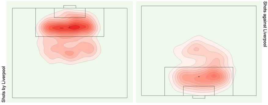
Using data from Wyscout, a company that compiles match videos and tags match events, we depict all shots made by Liverpool Football Club in the 2017-18 English Premier League (38 games, 638 shots). The accompanying code in R is on our GitHub page.
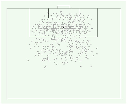
From the scatterplot, we can see that most shots were taken within the penalty area, where players have the highest chance of scoring. In fact, the chances of scoring is affected by angle and distance from goal—we will get to that in part two of this series. Nonetheless, there seem to be no other observable characteristics or pattern about this data.
How can we then make sense of the shape and distribution of these shots?
An Illustration
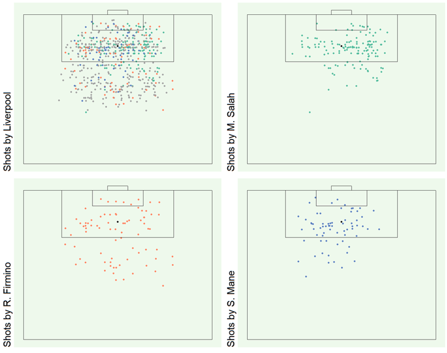
We could perhaps differentiate the shots based on which players made them; this may be useful if we wish to analyze the performance of individual players. For example, in Liverpool’s case, we may depict the shots made by their top three attackers:
While individual visual representations are helpful, how can we summarize these insights to enable comparisons with other teams?
A kernel density plot is a good way to achieve this.
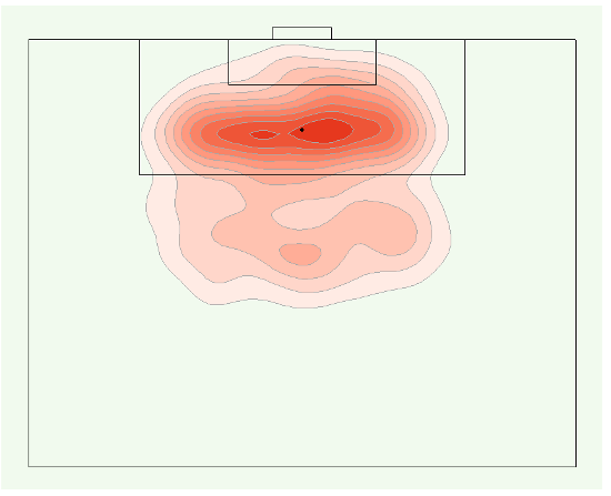
Kernel density plots reveal several insights:
First, we can identify the centers of data distribution, i.e. areas where players made the most shots. In the plot above, we see that there are 3 centers, one outside the penalty box, two inside the penalty box to the left and right sides of the goal.
Second, we can identify the concentration of data points from the centers, i.e. how close or far apart the data points are. The plot above is divided into ten areas, with each area containing about a tenth of all shots. Areas (or lines) that are closer together depict a concentrated number of shots made within those areas. We can see that shots tend to be concentrated inside the box, and more spread out outside the box.
In fact, the centers and concentration of this kernel density plot correspond directly to the shot patterns of the three Liverpool players depicted in the earlier scatterplot:
- Firmino, who makes infrequent shots but tends to shoot more from outside the box as compared to other attackers, is represented by the lighter colored center outside the box.
- Mane, who mostly shoots inside the box at the left of goal, is represented by the dark-colored small center; and
- Salah, who mostly shoots inside the box at the right of goal and who made twice as many shots as Mane, is represented by the dark-colored large center.
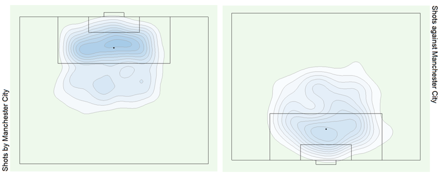
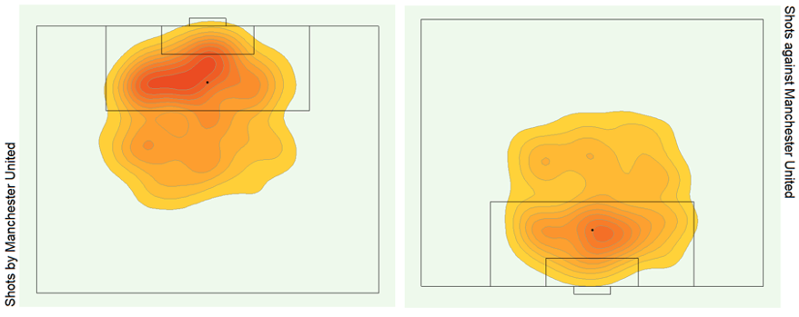
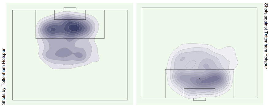
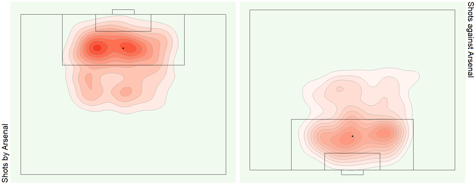
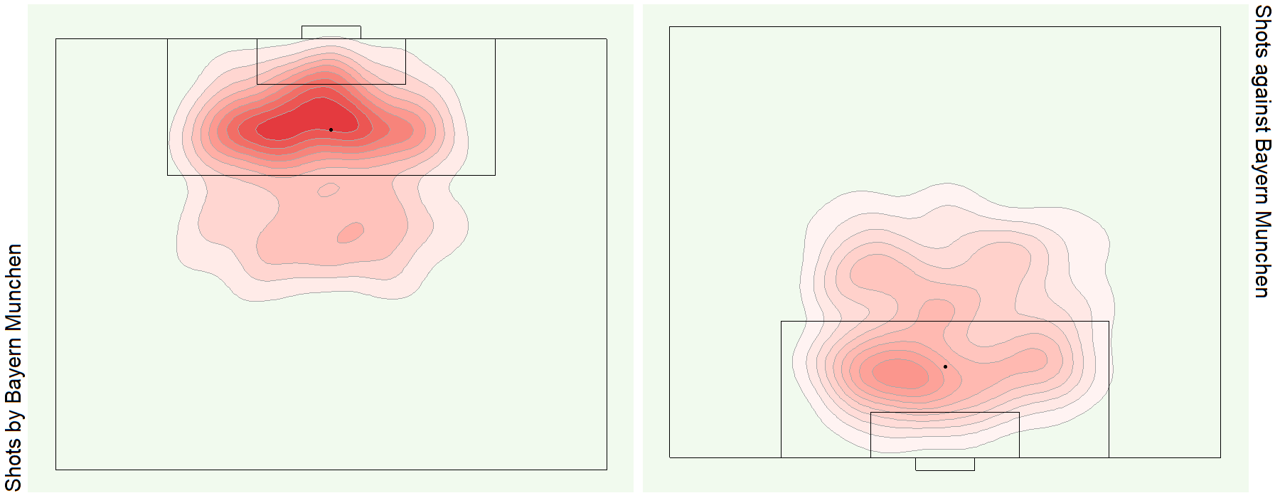
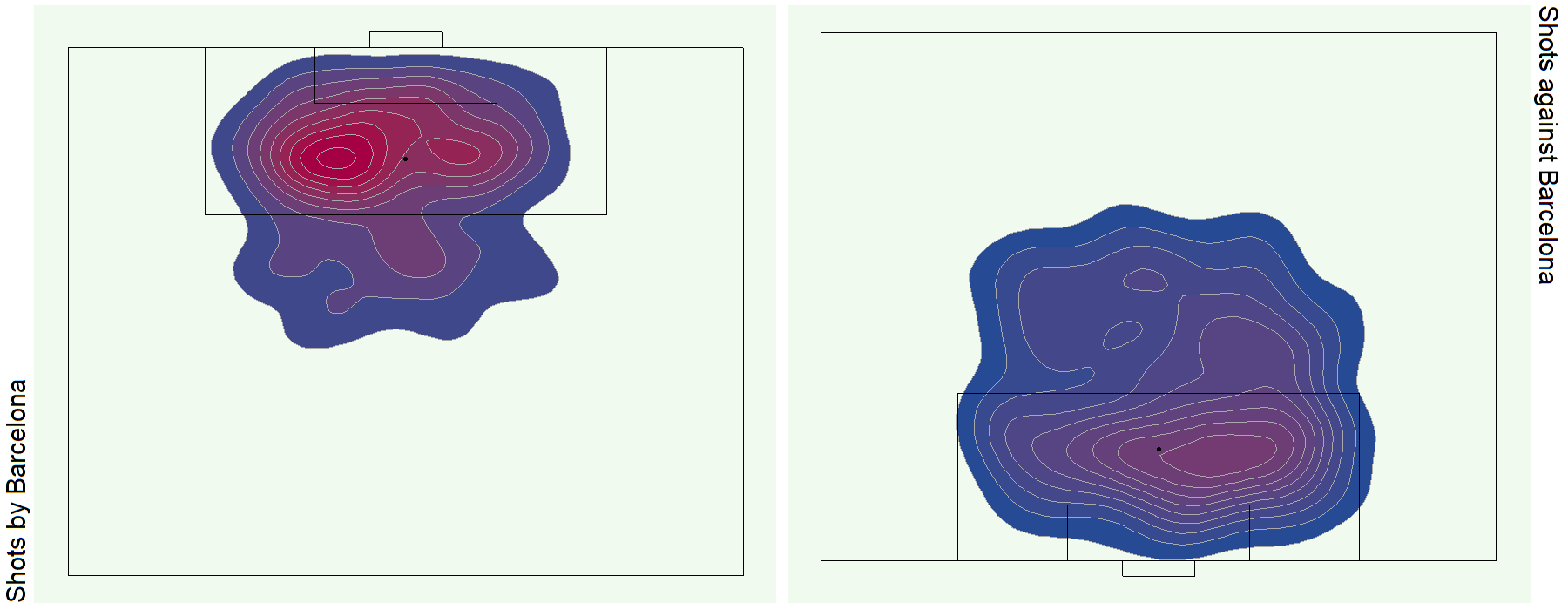
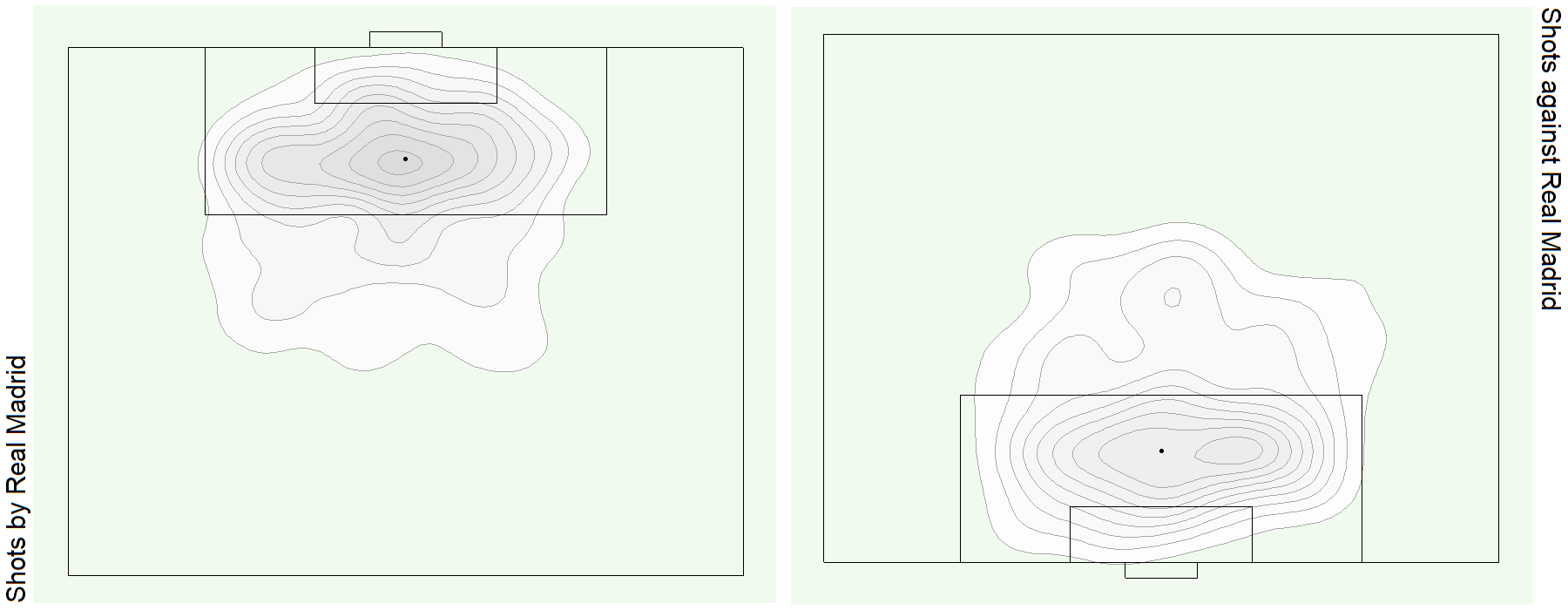
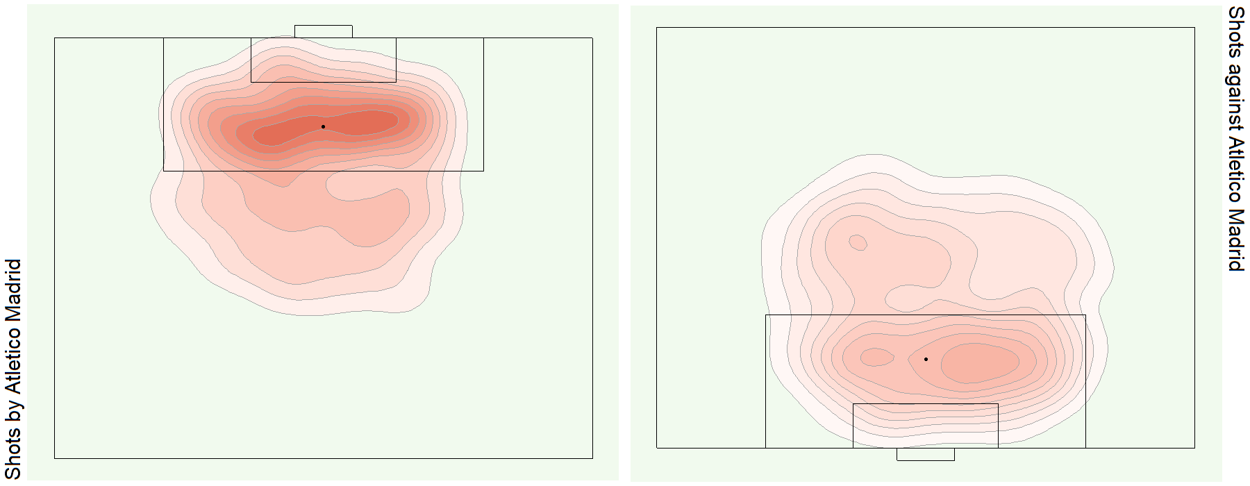
See bonus graphs at the end for an analysis of the top teams in Europe.
Technical Explanation
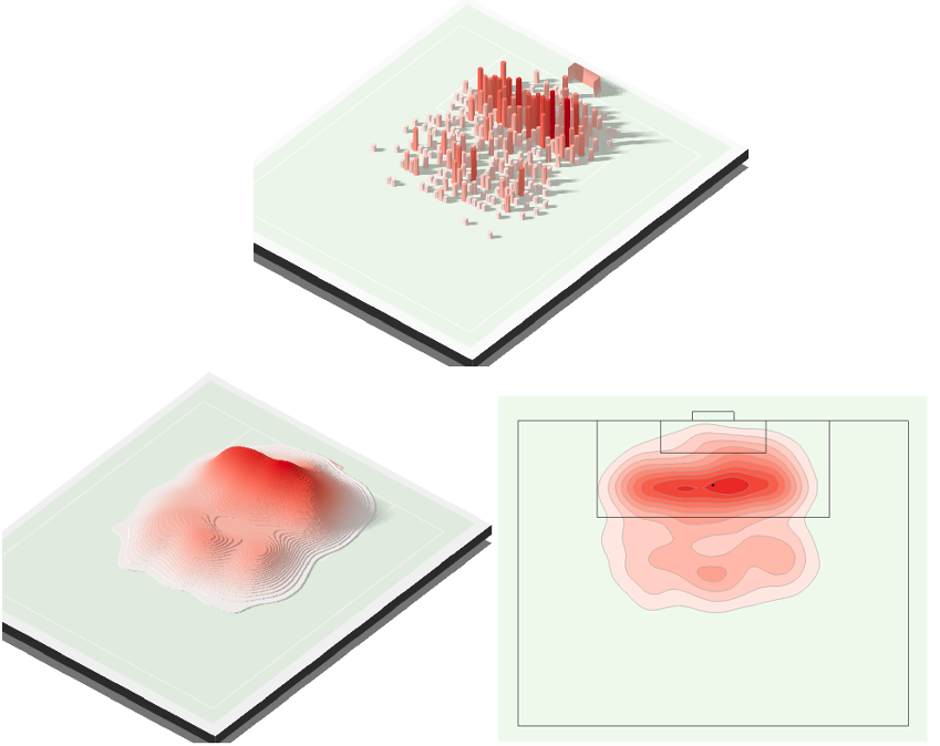
Think of kernel density plots as smoothed histograms. Going back to our analysis of Liverpool’s soccer play, we summarize the number of shots they made across 38 games in the 2017-18 Premier League season:
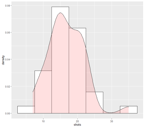
To visualize the underlying goal probability distribution, this histogram can be smoothed into a kernel density plot. This is done using a kernel, which is a function that transforms each data point into curves, before summing these individual curves to produce an overall probability density plot. Typically, a Gaussian kernel is used (i.e. Gaussian bell curve).
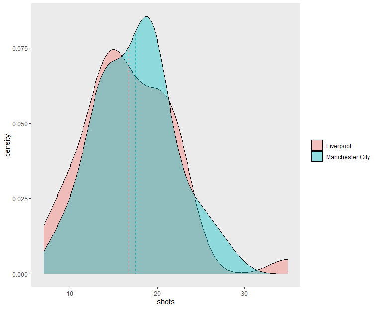
One advantage of kernel density plots over histograms is how two density plots can easily be compared. For example, the figure below compares Liverpool and Manchester City—we can see that the latter had a shot distribution with a higher average and a lower variance:
Histograms and kernel density plots also work if we have one additional dimension. Going back to the shots pattern analysis earlier, we can think of it as forming a histogram by counting the number of shots made in each part of the football field (a 2-dimension space). A kernel density plot can then be derived either in 3D or 2D.
Limitations
Hyperparameter tuning. Histograms can be rendered differently depending on the bin width, which specifies how big each bin will be. For example, in our first histogram, we used a bin width of 5, so the first bin holds all data points valued from 7.5 to 12.5. Smaller bin widths may make it difficult to see the overall trend, while larger bin widths may wash out features of the data. In kernel density plots, we must tune a bandwidth hyperparameter that works similarly to bin widths in histograms.
Interested to know how we can use these results to predict the probability of a goal based on where the shot was taken on the field? Follow us to be notified when part 2 of this series is published:

Bonus Graphs

Data Source
Pappalardo et al., (2019) A public data set of spatio-temporal match events in soccer competitions, Nature Scientific Data 6:236, https://www.nature.com/articles/s41597-019-0247-7
We used data from the 2017/2018 season of five national first division football competitions in Europe: England, France, Germany, Italy, and Spain. Over 1,800 matches, 3 million events, and 4,000 players were analyzed.
Data was first collected in video format before events (e.g. shots, goals) were being tagged by operators (e.g. position of shot, player who made the shot) through a proprietary software.
Copyright © 2015-Present Algobeans.com. All rights reserved. Be a cool bean.

grand! AI-Powered Drones Plant Thousands of Trees Daily 2025 jolly
LikeLike